Responsive player not responding right

Genavieve_Maxim

New member
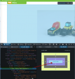
I'm working on putting the responsive version of the 360 player on my website product pages. Unfortunately, it's working funny. When I decrease the browser window, it will shrink ok for a while, but once it gets about to the width of a phone, the player expands to ridiculous proportions. I made the player not display on phones, since the site is live, but I made a dummy page, so this odd behavior can be seen.
http://www.maximenterprise.com/dummy-ca ... 3-pc-set-1
 

WebSupport

Active member
Hi!

I just checked your link quickly. Webrotate 360 product viewer is wrapped in your theme's .add-details div. The viewer is then instructed via CSS to scale its width 100% within .add-details which is fine.

If I then track .add-details dimensions in my inspector view, it doesn't seem to scale correctly in theme's responsive layout. It shows the exact pattern you described above. The viewer then follows its width exactly.

I hope this helps! Please let us know if anything.
 

Attachments

  • 5-11-2015 12-20-44 PM.png
    5-11-2015 12-20-44 PM.png
    163 KB · Views: 1,361

Genavieve_Maxim

New member
I just removed the add-details class from both sides of the layout, seems to be doing the same thing. Thanks for the quick response, though!
 

WebSupport

Active member
Now it it's div .col-sm-6 that shows the same odd scaling patterns (it was a parent of add-details).

I suggest to remove the viewer temporarily, then apply some background color to the parent div of the viewer (e.g .col-sm-6) so you could see how it scales and then once you are happy with how it scales, add the viewer.

Let us know if it doesn't help!
 

Genavieve_Maxim

New member
Doesnt seem to be .col-sm-6 either, also if I take that out, it removes the responsive columns. I tweaked it, and now it doesnt seem to do that weird expanding thing, but when im shrinking the browser size the 360 window will just stop shrinking at some point. However, it does look good on an actual cell phone, which is what Im aiming for, it's just oddly tall is all.
 

WebSupport

Active member
I see.. Other boxes on this page also stop shrinking at the same point if I manually resize the browser, so I guess it's expected with this theme. Regarding scaling of the viewer height, there's this option that you also have on the product page you shared (currently set to 0):

responsiveBaseWidth

Here's how it's described in our user guide:

This is a viewer width in pixel (numeric) that you can set to allow the viewer window to scale not just horizontally, which works by default if a parent container has a relative width, but also vertically as well. It usually represents your default viewer width as per your base / default page layout design before any responsive scaling is applied. When it’s set, the height of the viewer is automatically scaled relative to the scaled width.

I hope it helps!
 
Top